
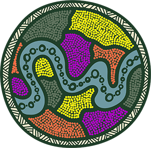
The logo represents looking through the lens at Brisbane to map the future.
The inner dot patches represents the diversity in both ideas and people; coming together in Brisbane to share ideas in creating a positive future.
The iconic Brisbane river runs through the middle, as well as being a pathway for sharing knowledge.
The ring around the outside represents the conference theme 'Through the lens', made up of the four sub-themes.
The colour palette represents Brisbane and has been influenced by key fauna and flora that are iconic to the area: wetlands, river, sea, mangroves, botanical gardens, wattle and bougainvillea (iconic in South Bank).
About the designer

Keisha Thomason is an Aboriginal Graphic Designer and Artist. Keisha is a proud Waanyi and Kalkadoon woman. Her artwork style is contemporary, influenced by her culture, identity and the modern world.
Website: leondesign.co